9CMS – CBC's In-House Publishing Platform
When CBC’s vendor-supported CMS was deprecated, the organization needed a fast, cost-effective internal replacement to ensure continuity in content production and support ongoing digital innovation. The stakes were high: without a new system, just under 800 of CBC’s digital producers would be left relying on unsupported, potentially insecure software, and internal teams wouldn’t be able to update key audience-facing platforms — including CBC.ca and the CBC News apps, which serve millions of daily active users.
I joined the project at a pivotal moment. A developer-led proof of concept existed, but there was no design support or product structure in place. I introduced a formal design process to a fast-moving, multidisciplinary team, created a foundational design system from scratch, and partnered with a UX researcher to lead discovery and usability testing. I also worked closely with our product manager and lead developer to co-lead the roadmap and guide product and UX decision-making.
The result: a scalable, user-centered CMS that empowered CBC’s producers, enabled greater agility across its digital platforms, and positioned the organization to eliminate costly vendor dependencies.
Date: 2022-Current
Role: Product Designer
Tools: Figma
Company: CBC (Canada’s national broadcaster)
9CMS: Before and After
Before diving into the details, here’s an example of one of the main workflows, both before I joined the team and after I redesigned the product.
Before Redesign


After Redesign


UI Styling and Colours
When I joined the project, the design needed to be created from the ground up. The previous vendor product that producers had been using also had very poor design. During user tests of the legacy vendor product producers had complained about current software being “depressing” and “boring” to stare at for hours a day. I wanted to make something that would be visually pleasing and make producers happier at work, enhancing the workplace experience without distracting from their work tasks. For inspiration, I looked to existing publishing products at our company and a new branding roll out that we were experiencing.

Testing New Colours on Existing Designs
I then tried placing the colours in existing interfaces in our publishing product suite. We had an existing data analytics product that I was using for inspiration. The intention was for both products to be sisters and have similar styles. We were planning to use Material UI for both products and I thought it would be best for the colours to work well together as well.
The current colour scheme for our data analytics platform was very bright red which I thought was not ideal for UI. It made the product look aggressive and alarming, not great when our users were already stressed from their jobs. As part of my work on our new CMS, I also wanted to update the colours for the data analytics platform, and used it’s current UI as a way to test some of my colour ideas as well as using screenshots of the current CMS to quickly try out ideas.

Translating Existing Branding Colours to Digital Friendly Ones
To begin with, I took a screenshot of one of the new marketing materials containing our new branding colours. These colours were for marketing purposes and it hadn’t yet been decided how these colours would be integrated into our digital products.
I took swatches of the colours and started working with them in UI elements. Most of the colours were too low contrast to meet accessibility guidelines, so I also started iterating with different shades and tints, focusing on the blue and teal colours as primary colours.

Applying New Colours to New Product Designs
Already with a bit of colour changes and a new navigation side bar, the product was looking so much more professional! We went forward with the design having a teal main colour.
Creating the Design System
We had decided to use Material UI as a basis for our product. To speed up the process of creating a design system, we bought a prebuilt Figma pack that had all of the Material UI components and I customized it to fit our styling needs. I also collaborated with our in house accessibility team to customize the components to meet the high standards for accessibility necessary at a public service company.

Figma Variants and Crafting a Colour System
For colours, I used the existing colours in the component library that most closely matched my earlier colour exploration. I then customised them to be high enough contrast to fit accessibility needs. As part of our accessibility audit, I also customized many of the interactive states of various elements.

Developer Collaboration and Coding the Design System
I created a JSON of the component library and collaborated with the developers to implement the design system in their existing code database. When I updated the design system in the future, I would be able to download another JSON of the design system so that the developers could use it to update their code and stay in sync with the design system in Figma. This cohesion between code and designs enables better designer/developer collaboration and a better end product!
Designing the Story Creation and Editing Workflow
The product had a new style and a functioning design system, now I could use it to design solutions to real product needs. The first one I tackled was Story Creation and Editing, an essential workflow for digital content producers.
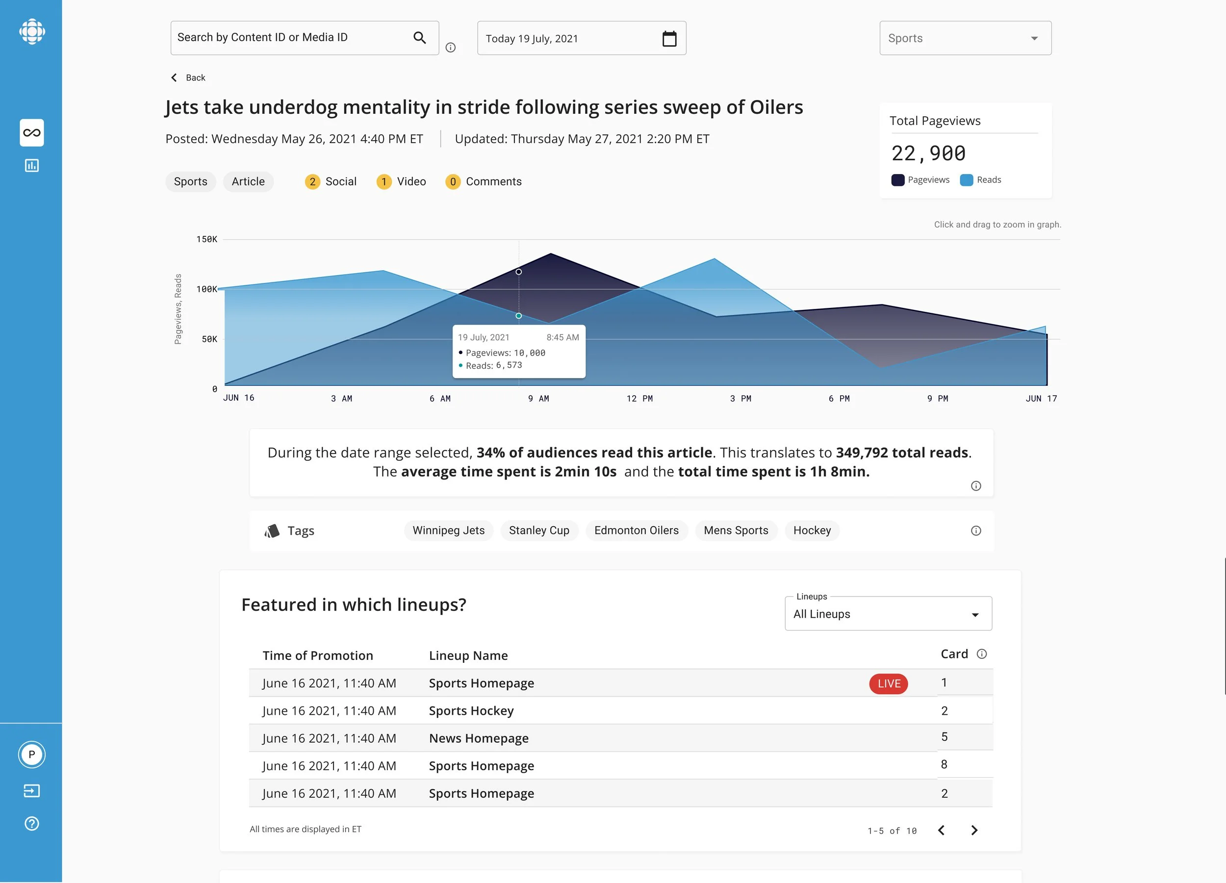
Before: Legacy Product Being Replaced

The publishing UI from our legacy CMS product.
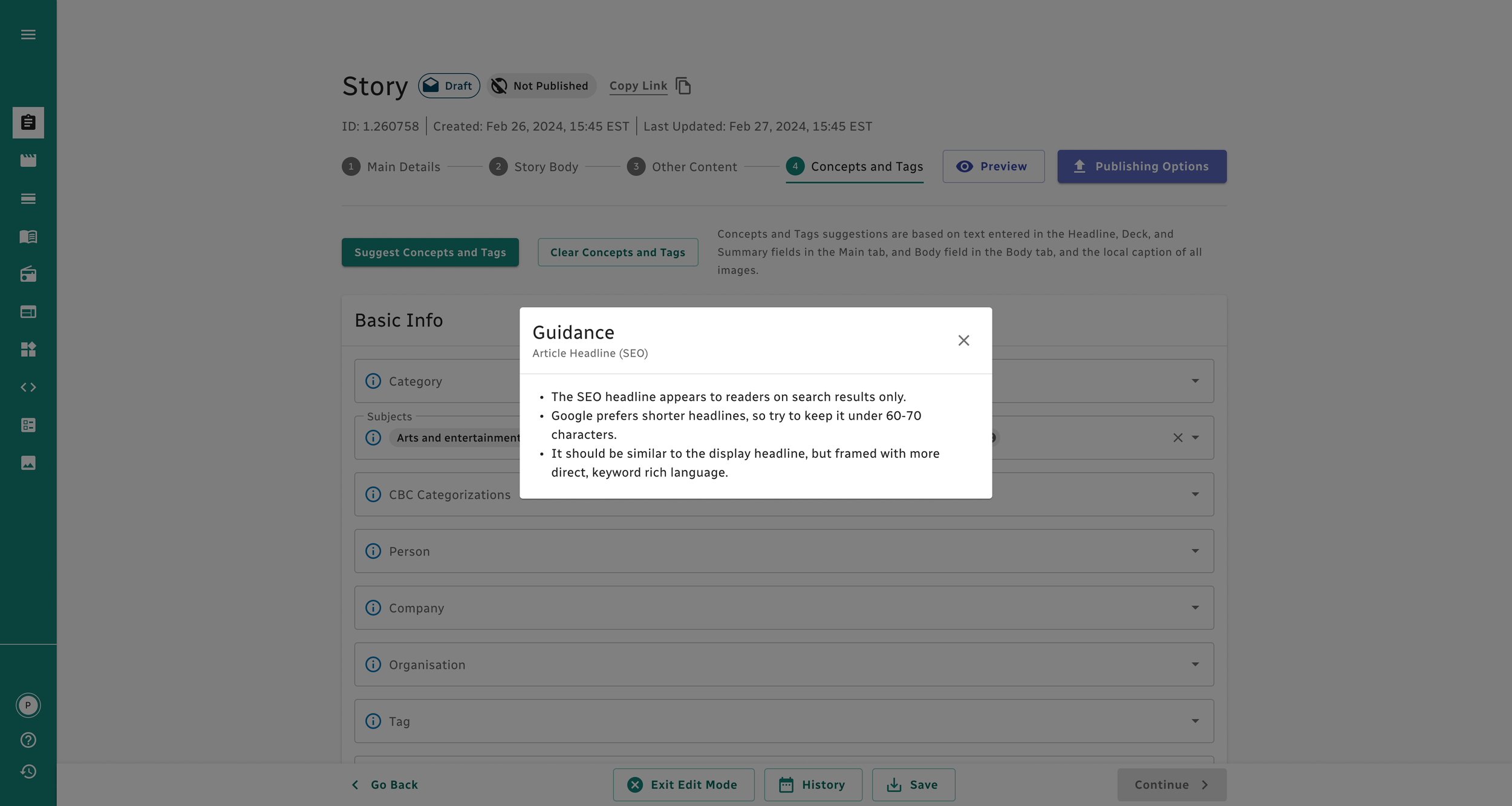
After: The New 9CMS

The newly designed publishing process I designed for our updated CMS product.
Discovery Research
For the research I worked in collaboration with a UX Researcher and Content Producer Leads. For early product testing and feedback, we gathered a group of 100 “super users” who were dedicated to working with us on the product in addition to their regular work responsibilities. The most important next step for the product was designing out the story workflow, which was the workflow used by producers to write, manage, and upload digital stories to both our website and app. This would allow us to introduce research as a process to the current team and get to know our users without causing too much disruption to the existing product process.
For our strategy, we used guided interviews and contextual inquiries with targeted participants from both the News department and EFS (Entertainment, Factual, and Sports). We collaborated with the leads of those departments to make sure that our users were a diverse representation of different producer needs.
The UX researcher created an interview script for the guided interviews that sought to answer these general questions:
When do users interact with the story workflow?
Why do they engage with the story workflow?
What are the pain points in the current process?
What workarounds or “hacks” are being used at the moment and what are their drawbacks?
How do they anticipate the story workflow to change due to new organizational goals?
For our contextual inquiries, we went on site to shadow Content Producers as they went through the process of creating and managing stories to get a deeper understanding of the user flow in context.
The UX researcher created an analysis and organized the data from the interviews and assembled a user journey that I then used as I was creating the improved story workflow designs.

Different Users, Different Needs
One of the challenges with this product is that it’s going to be used across the entire national company that comprised multiple teams across news, entertainment, and factual divisions. Content production itself is already a complex process with many moving parts, but on top of that, each team had slightly different needs and work processes.
One of the things we had to do with our research and consistent touch points with content production stakeholders was align on what the best practices and needs were from the product. We also used quantitative user data to see which features in the previous product had been used regular and how they had been used to guide our decision making.
As a designer, I was adaptive to changing requirements, tested assumptions continuously, and weighed differing needs from a complex set of users.
I did quick iterations of designs based on requirements and got fast feedback from our technical and product team members to make sure we were capturing the complex product needs, meeting deadlines, and staying within technical feasibility.
Don’t Make Me Think Too Much
It wasn’t just difficult for our team to keep all of the different work flow practices and content standards clear in our minds. This was also a challenge to communicate clearly across such a large and distributed workforce. Our user research showed a lot of confusion about how best to use their current CMS.
I wanted to add in support for users that wasn’t just limited to “how to use this feature” but baked in real guidance for producing stories based on lead producers’ decisions. I designed the “Guidance” feature that places blue info buttons next to fields where users can click to get more information about best practices. A popup appears that guides the user with best practices and tips. We made this in collaboration with the content leads who wrote and signed off of all of the guidance text.
Systems, Processes, and a Complex Product?
The team had never had a designer before I joined. This meant that design processes and systems had to be built from the ground up.
How to Integrate Design Processes?
This team had existed as a group of developers and a product manager for a long time and had initially started as a developer’s side project. Because of this, the team wasn’t used to working with designers or integrating design into the process. We also had a deadline looming with a lot of work to do. This meant that there was quite a bit of resistance to integrating design processes. In order to move the project forward and mature the design process of the product and team, there was a lot of trust building and communication that I needed to engage in.
Primarily, this looked like consistently delivering on promises, involving team members in the process, taking feedback seriously while pushing back when needed, and building empathy for their struggles.
One of the biggest wins I had with this early on, was delivering on the promised design system. It was a lofty project, and I encountered a lot of skepticism and pushback from the team initially. Once it was delivered and the team saw I could deliver what I promised when I promised it, they were a lot more willing to listen to my perspectives.


How to Craft a Complex, Technical Product?
This product needed to encompass multiple complex workflows that internal producers would be using for the daily work. It involved deep domain knowledge of media production in general and how media production worked specifically at the CBC. It also involved deep understanding of how our backend CMS system would connect to audience facing products. This was a big task.
The way I approached this was with extensive documentation, relying on regular user research, and constant communication with stakeholders and team members.
Because this was such a complex space, I would regularly present mockups of design solutions to team members to get their feedback on the design direction and also to bring in their knowledge about the product and check blind spots. We had regular touchpoint with stakeholders in the media production side of the business to keep up to date with their work, find any missing feature areas in our product, and hear feedback on the latest iterations.
Regular research and testing of the designs also provided a space to get deeper understanding of the workflow, fix blindspots, find pain points, and build empathy with users.
The design system provided a substantial foundation to understand how the UI was supposed to look and how the interactions with common elements were designed. It was helpful to designers and developers as a reference point. On top of that, I created a master design where I would regularly update existing handoffs to keep them consistent with the many changes being made to the product.
Results So Far
The response from producers and team members has been overwhelmingly positive. There is a lot more excitement and optimism for the project now that people have seen the new designs. Feedback has been that the project finally feels like a real product, and our producer users are eager to be involved with helping us improve the designs. Having the design system has allowed me to move faster and with higher quality and the user research has improved the product and helped us move forward with more confidence. The developers and product manager are excited to collaborate with me and bring the work to the next level.